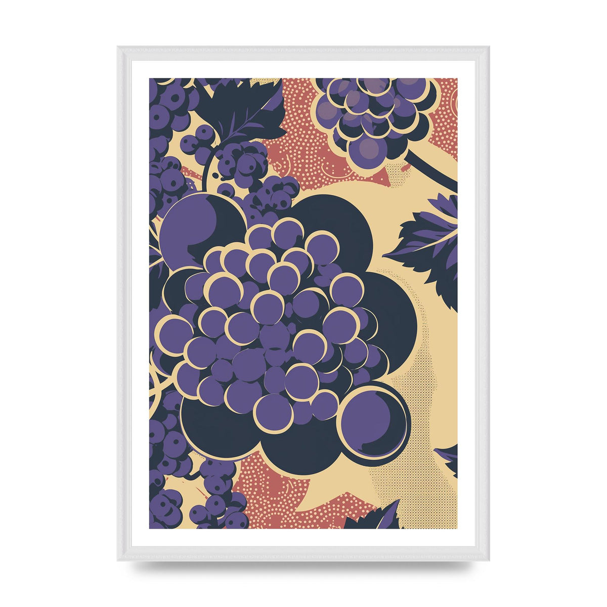
Simplified Grape Berries Woodblock Style
Simplified Grape Berries Woodblock Style
Title: Grapes in Woodblock Print Fashion
Read more
Introduction: In this analysis, I will illustrate a bunch of grapes with each berry simplified into circles against a stark background in a woodblock print fashion for text. This art form, commonly associated with traditional Japanese printmaking, employs intricate detailing, bold contrasts, and simplified shapes. By utilizing this technique, the essence of the grapes can be captured while providing an aesthetically pleasing visual experience.
Composition: The composition centers on a bunch of grapes, carefully arranged in a way that showcases their organic form. The bunch sits slightly off-center, allowing for dynamic negative space to interact with the text. The artist employs a stark background, which can be created using bold and contrasting colors to enhance the visual impact.
Technique: To achieve the woodblock print effect, the artist simplifies the individual grapes into circular shapes. Each circle represents a berry, creating a repetitive pattern that evokes the grapes' overall appearance. Depending on the desired level of details, the artist can choose to include additional concentric circles within each grape circle, adding depth while maintaining simplicity.
Woodblock print style warrants the use of bold, black outlines to define each grape and create a clear distinction between different elements. The shading and texturing techniques used in this style may include hatching or cross-hatching, simulating the traditional carving lines left by woodblock tools.
Color: Traditionally, woodblock prints are limited to a few colors due to the printing process. Therefore, artists often choose a limited color palette to achieve the desired effect. The grapes can be depicted in shades of deep purple or vibrant green, depending on the variety. Keep in mind that the stark background can be monochromatic, using a bold color such as black or rich brown, which will further enhance the visual impact of the illustration.
Typography: To incorporate text into the woodblock print fashion, the artist can choose to integrate Japanese calligraphy or incorporate stylized English text. The goal is to maintain the overall aesthetic and harmony within the composition. The typography can be positioned purposefully within the negative space, interacting with the grape circles, or layered in a separate area while maintaining a cohesive presence within the illustration.
Conclusion: Illustrating a bunch of grapes with each berry simplified into circles against a stark background in a woodblock print fashion exhibits the artist's ability to blend traditional Japanese printmaking techniques with the subject matter. This stylized approach captures the essence of the grapes while providing an aesthetically pleasing composition. The final result embodies the principles of woodblock print art, utilizing simplified shapes, bold contrasts, and carefully chosen colors to create an engaging visual experience.
Size guide
Size guide
All our prints are made to standard A sizes. The measurements below are the picture size — the printed image area. If you choose a framed option, the frame sits around this area, so the finished piece on your wall will be a little larger.
| Size | Centimetres | Inches |
|---|---|---|
| A4 | 21 x 29.7 cm | 8.3 x 11.7 in |
| A3 | 29.7 x 42 cm | 11.7 x 16.5 in |
| A2 | 42 x 59.4 cm | 16.5 x 23.4 in |

Couldn't load pickup availability